11.52am

Having survived the Belstead MA summer schools I have a complicated and probably over ambitious day in the NUCA print workshop planned. I have two plates to work on. One of them is the plate I made with Dom Theobald last week during Innovative Printmaking. We used a Lascaux water based etching ground which I used to paint on an image and then we dipped it in ferric before Dom gave it a couple of goes with the car paint aqua tint method. The result was OK but only a rather vague image. My intention has been to clean the plate and reground it traditionally to work over it again with some writing. Then finish off with another image drawn from the week in another layer. So far though it has taken most of the morning to get the blue stuff off the back of the plate as I have had to go and buy some Cif and a scourer to do it. I am about to reground it. The other plate is in the acid. This one has a thin layer of the blue stuff on and I have scratched an image through it based on the botanical images I found in the old books in the library room I was working in for part of the week. I am giving that a very deep bite to see what it does and will then probably reground it. The works is based on the learning journal work that I did at the summer school. This is finishing off the project really. This afternoon I am with David and the laser cutter to try to make a multiple where the object that comes out is the print – a probject, prinject or objint perhaps?

9.25 pm

A reasonably successful day. The laser prints more or less went to plan bar some fiddling about to make the thing only engrave the lines once rather than twice. The results are fine and pleasingly uniform. I ended up with ten and a couple of trials so an edition of ten. I did intend to post them out but they look a bit good for that and have taken more time than I thought. Back with a slightly simplified effort on Thursday to have another go at ‘printing’ another ten of Belstead Variation II. The etching plates I worked on between the laser cutting moved on. The one on the plate with the thin layer of acrylic ground etched quite well though it was difficult to get the ground off. It took half a bottle of Cif to do it. There must be a better way. The other plate I worked at lunchtime (to the bemusement of my bench mate) and redipped for an hour or so. I also printed the large plate with the shoes on but failed to get a successful print at all. Either over rubbed the aquatint or under rubbed, couldn’t get it right.

Had an interesting conversation with Sonya about the laser cutter. She was disappointed with the speed and power of the thing which restricts the usability of it and she pointed out that it had been bought mainly for textiles to flatten the nap of velvet more than anything else, which it is good at.

On Thursday afternoon I spent my NUCA time with Sarah, the drawing workshop manager, and the laser cutter in the LRC. I had been told about the laser cutters potential for printmaking by Joe Baker who had used it to engrave on plastic which he was then printing with intaglio. I wasn’t too sure about the results but I was interested in the idea of using a machine to produce a cut print-a computer meets the wood cut.

I am interested in the idea of the hand drawn mark, the autographic mark, being transcribed by machines in some way and I am always interested in the way an idea gets changed as it interacts with technology. It is a way of finding out about technology and the assumptions embedded in the design of the machinery. Of course this is true of paints and pencils and all the other ‘minor’ technologies that are so old and that we are so used to that we barely consider them technologies at all. I have a lesson script for the history of the pencil that I unroll for the children which tries to point out that the pencil has a relatively short history, back to the Henry VIII and a thunderstorm in Cumbria. Most children and a lot of teachers think technology means something you can plug in these days, the word has been usurped.

But anyway. I am interested in this interaction between idea and translation by machine especially as I tend to be a gestural mark maker the idea of a computer translating marks into a material seems intriguing. I took a photo of one of the big drawings that I made at the end of last term with Payne’s Grey acrylic on 50 x 60 cm cartridge paper. These featured in the NUCA show in April. This set of drawings were meant to be somewhere between Lasker and Matta and Guston. Particularly the tiny little forms in the back of some Matta drawings I had seen at the SCVA. They were meant to be cartoon free-associations, comic-book automatism.

Glyph image for the laser cutter.

Glyph image for the laser cutter. Originated as a painted image with acrylic and brush then fiddled with in Photoshop to reduce the colours.

I thought they would work in the laser cutter by being relatively bold and straightforward. I meant the image to be what I believe is called rastered out which means that the laser burns way all that is white in this image so that only the black bits are raised up. Then a roller would be used to put a layer of ink across the raised area, a piece of paper put on top and burnished so that the ink is transferred to the paper. The classic wood cut, as loved by Modernist Expressionists like Beckmann and Co. Another part of the appeal – to take a method associated with hacking and carving and expressive marks in this tradition and rendering it coolly computer generated at several removes from my original mark.

However, part of what is going on here is that I don’t really understand the machines raison d’etre. It is a piece of industrial plant  designed to cut things out and perhaps do a bit of engraving but not really to render woodcuts for me. Rastering out the white bit of the image would take a long time, make a lot of smoke for the extractor fan and would still require sensitive printing to get a result. Sarah suggested cutting the image out of 3mm medium density fibreboard and then gluing the pieces down to make the relief printing block. This, for this image, is a great idea. Sarah had made some tests with a jpeg image I had sent her and when I got there she presented me with this rather fantastic great 800 mm piece of wood with the image cut out and another piece of wood underneath ready to have the top bits glued on, burnt to show where the bits should go. This all done in one go with the laser set to burn through the top piece but not the bottom piece.

Laser Cutter 01

Large laser cut image with base board helpfully scorched ready for top pieces to be glued on.

I was surprised by this as I had been thinking about the prints being 8 x 10 inches, like the etchings so that they obviously fit as a series and we spent the afternoon experimenting with the bits of plywood that I bought with me. The cutter didn’t like the plywood very much and wasn’t happy cutting through it. We had another go with the 3mm mdf and it went through it like no bodies business and I took away tow successful cuts, the large one and a small one.

We also talked about trying to make the accompanying text image into a print. This was part of my interest in the machine aside. If this can render text as a relief print then I could make prints that have that ‘teacher voice’ on or overlaying images. It seems a taller order than I thought and I left Sarah with an Illustrator file to think about it. She pointed out that the text didn’t really full encompass the difficulties of the process and this is true. I hadn’t forseen the complexities of the process at all and I was also thinking about how one would describe it to year seven as well. There is a possibility of a fuller and franker explanation though that wouldn’t be a classroom description. We briefly discussed the idea of a range of signs, each explaining how the previous sign had been made so the wood cut was explained by a screen print and the screen print by an etching and so on.

Large laser cut print.

I haven’t been to school since so it is all in the boot waiting to go to school to be glued down. The car smells strongly of burnt wood. Thinking about it I realise how little I understood the machine. I am disappointed that it won’t practically raster an image and I am prepared to have another go and prepare an image that would need less wood burning away which might help. I like the way that the edge of the brush marks has been rendered by the machine. The gesture is still there but it has been digitised. I am still interested in the idea and I will pursue it further. I like the large scale of the image Sarah cut. It wasn’t my intention but it seems to be part of what the machine can do that my hand can’t. It can cut a far bigger image than I could be bothered to cut by hand far, far quicker. There is also the possibility of experimenting with the machine replicating marks into pattern and repetition. The point has to be what the machine can do that I can’t? What does it extend your capabilities to do?  What is in the nature of the machine that will give the images a distinct look that perhaps reflects the tensions between the history of the Expressionist wood cut, the translation of a brush mark into a cut mark and so on?

I still have a large etching in the print room with an aquatint on it waiting for its final immersion, cleaning and printing plus two 8 x 10 inch plates with grounds on knocking about, waiting for images. There are nine days of school to go and then I am teaching on an ARU summer school and then I shall have a month to ‘be an artist’ for a bit.

The laser cutting through the 3 mm wood to make the second smaller print.

Wingfield Barns map

You should re-write the title of your project every couple of months or so to see how things have changed. So the subtitle has altered to reflect recent thinking. Considering the confirmation feedback over the last few weeks, mulling it over really and letting it sink in. It emerged in the meeting that the artist teacher bit was probably not the most interesting bit and there is an article in iJade this month which is very much about the artist teacher. It is looking a well trammelled bit of turf with Daichendt’s book Artist-Teacher. I think my interest is probably in a subsection of the general area of the artist-teacher, particularly the role of the demonstration in the classroom and the idea of the art work as demonstration.

For a lot of art teachers the only art work they make is the work they make to demonstrate ideas or techniques in the classroom. Could this be seen as an art practicee? Should art teachers value this sort of work as practice? Should art teachers just value this sort of work more?

If you make a lot of work in the classroom how much does that change your practice? The work might be demonstrating something to someone in the classroom which might be one category of work- actual performative demonstration in the classroom. Other sorts of demonstration can be the sort that I make anyway when I am thinking about how to do something in the classroom, when I am looking for a way in. The sets of Davie style drawings that I did on a PD day would be an example. Not necessarily made as classroom material or with the classroom in mind to start with but they became so as I made them and thought about them as a potential project. I did mono-prints as a prep for a project in the trialling phase which became the Sandra Blow project a couple of years ago.

If one makes a lot of work of this sort how far can this be said to ‘infect’ the art practice away from the classroom? There is a way in which I end up demonstrating things to myself in a way. But what am I demonstrating and why? The etchings are almost me demonstrating to myself how to make an etching. There is a sort of running commentary in my head unpacking the process of making them as I make them.

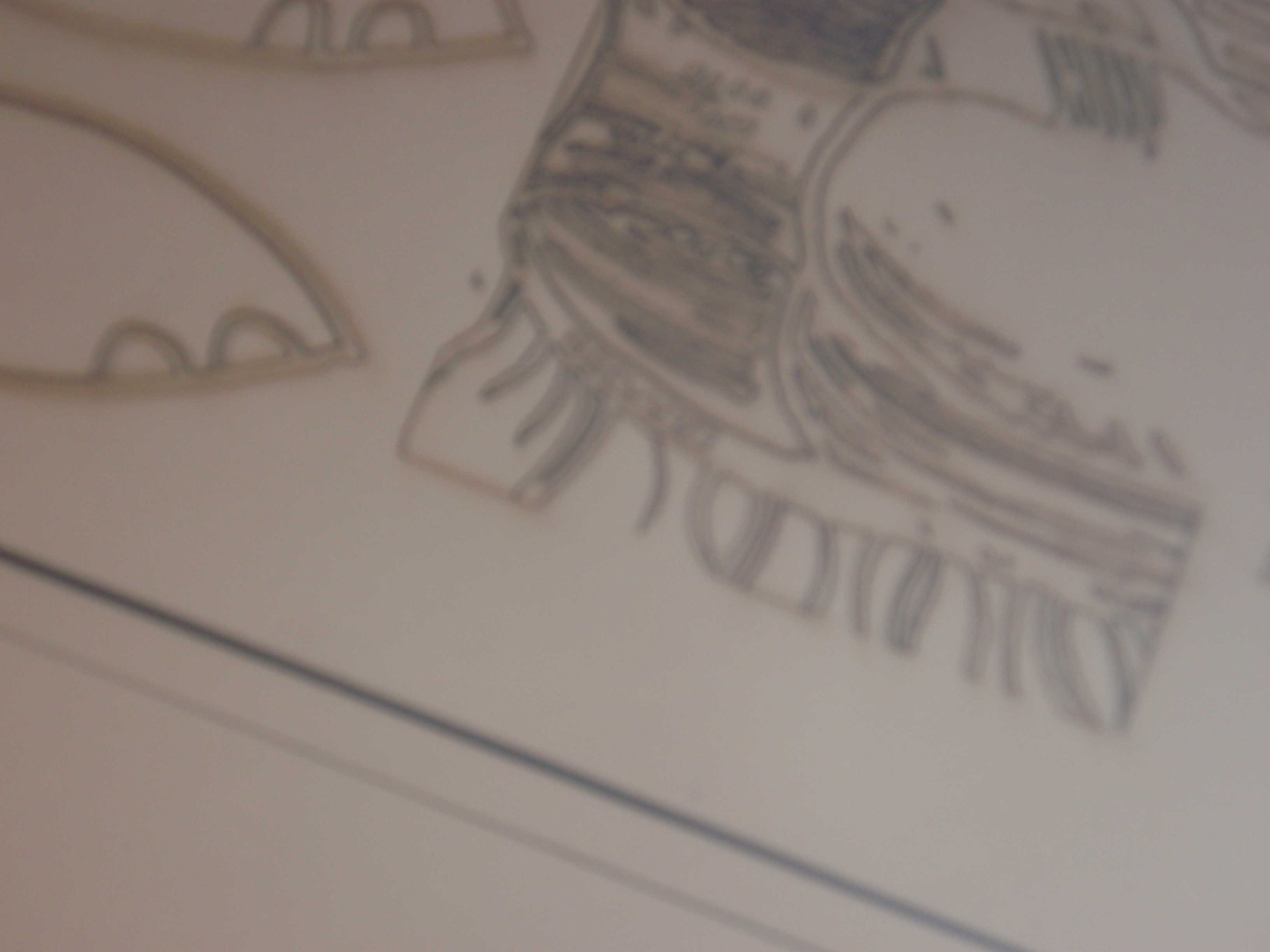
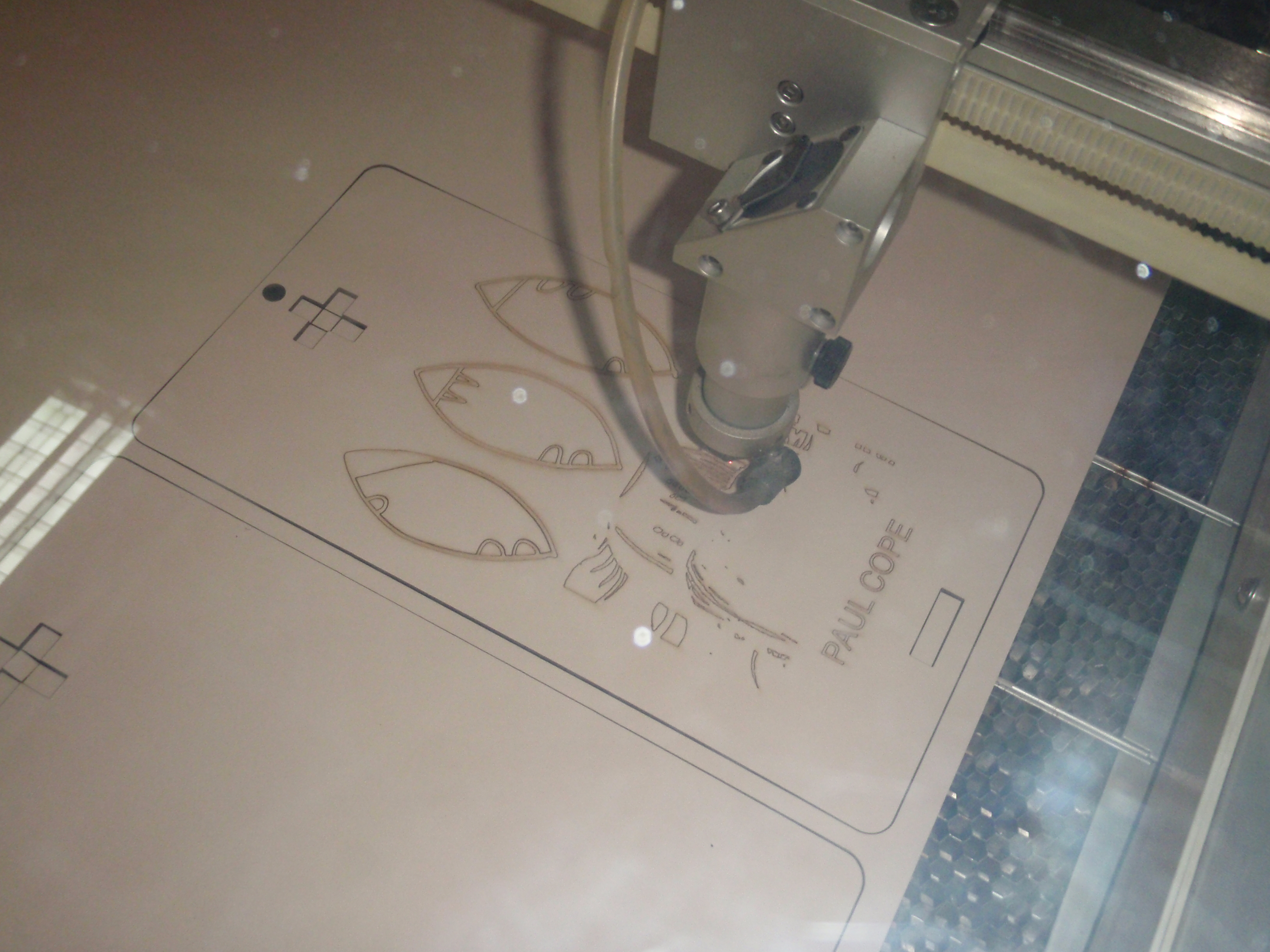
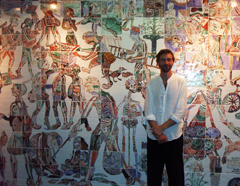
This week I prepared some digital files for the laser cutter at NUCA to see if it can cut type onto wood to make a relief print. Hand-cutting type or writing it backwards on an etching plate is going to be a drag.  The text is a monologue on the process of making the print as if I am telling year eight how to do one. The image is from a photo of one of the big ‘formal experiment’ brush drawings I did at the end of last term. The idea is to overlay one over the other with transparent ink. So the idea is to make this ‘teacher voice’ or ‘demonstrator’s voice’ part of the art work as it is in the big hand paintings. I would like to do it in the prints too.

Text for a laser cut print

One of the effects of the teaching practice has been to make the art practice extremely diverse. I now make work with a far wider range of materials and techniques than I did at college or before teaching. When I was at college I made video and film, made photos and did a lot of drawing, animation and painting and print. So I was always quite diverse in my art work but since entering teaching it has become even more diverse. This is partly because I have been a one man band in the school but I have had to teach the range of media and techniques that the National Curriculum requires. This has particularly taken me into 3D and sculpture which I had rarely done previously. At the moment we have a set of masks based on the work of Calixte Dakpogan on the wall along with a second set of Niki De Saint Phalle sculptures by year 8 being finished (they liked the year 6 ones and wanted to have a go) plus a very fine set of large scale Pop pieces based on Oldenburg and van Bruggen. Then there is all the ceramic work which is something I learnt how to do on the teacher training course at Middlesex and have developed since. Plus the textile work and the moulds and plaster work and so on and so on.

I learn something new to teach the pupils and then I will go off on one and make a series of things using that technique until I get bored or the next thing comes along and then I’ll go back to it later or perhaps not. The set of ceramic biscuits I made (biscuit fired) when I was into moulds for a year would be an example.

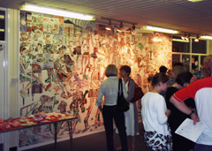
The need to teach a wide variety of techniques and artists keeps the work moving around and not really settling into one groove. This has become a feature of the work. No two shows the same.

The use of artists as deliberate influence must be a factor too, the use of styles and artist’s working methods in the classroom. The role of influence as a teaching and learning tool in the classroom is one part of the question but as far as the art practice is concerned it has an impact on how the work is done. It keeps it diverse too. I described it to Dom Theobald as running the working methods of various artists through my own practice. What effect does that have? How does that impact on my work and how I feel about it?

How to approach this then? My initial thinking is that I have to work more from the art practice. If the confirmation documentation was heavily dominated by educational research methods and ideas (which is where I come from) towards art practice but not really finding it (‘where is the art practice in this?’ question in the confirmation meetings) then really I have to explore the practice and connect it back to the classroom. The practice might be the shape it is because of the classroom and the habitual practice of teaching but it is still a distinct thing from the teaching practice, it does stand away from it.

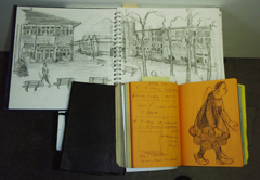
I need to document and catalogue the art practice and describe it in its diversity. What shape does it have? I need to know more about practice as research and I need to spend the summer making work and reading up on that, a lot. The current case studies as they exist in the research seem somewhat limiting and they are too classroom focussed to be useful. They feel like millstones rather than stepping stones. And they have come to misrepresent the work in the classroom and that can’t be the right thing. So perhaps the classroom work with the pupils and there work can be more tangential and seen through their outcomes on display  more than anything else. The case studies exist in the way that they do due to the ethical procedures about using the images of the pupils and their words but there is less of a problem if just the final work is used in the report.

I feel more interested in this as a direction and more energised than I had been as I ploughed through the case study with the attendant over focus on the one artist. The project is supposed to be a practice based project and that is what I was originally interested in learning about when I started, art practice as research. I should be more confident about the practice and be happier to use it, funny, odd and diverse as it is, as the centre of the project.

This farmer worked in the barn when it was a farm.

We had the opening of the Culture of the Countryside exhibition at Wingfield Barns this evening. The mural was well received by all. I was particularly pleased that it gained the approval of this gentleman who had actually worked in the barn when it was a farm, many years ago. He was pleased to see that I had got the names of the fields right.

The website was also launched and it features Gisleham Middle School and our part in the project over the last three years in several catagories. And, of course, there is a bit about me.

I was asked to make another temporary wall painting for the Culture of the Countryside project, this time for the show at Wingfield Barns. Yesterday I spent the day in the barn with my Mac, a projector and Jo Wylie at Glastonbury on the radio. It took from 9.30 to 5.30 to do, with a twenty minute break for lunch. I used umber, white, black and cerulean blue acrylic paint to restrict the palette. I had been asked to mention the field names and the villages of the schools that had taken part in the show which gave the initial map the range. I had been supplied with a scan of a Victorian OS type map and a detail of the Wingfield college site. I had taken a photo of a fold out map in a book of the Wingfield College estate with the field names on. There was no way the scale of these maps would marry up at all. I did mention the notion of a palimpsest during the planning stage.

Final map painting at 5.30pm on Saturday.

The previous map painting I made using an overhead projector and I arranged the digital files and printed them out onto transparent sheet. This time I decided to use a digital projector as I thought I would be able to control the light and darkness in the room more easily. It also meant that I didn’t have to prep the image in the same way. I used Google maps to make a basic map of the whole region which is what I did for the Halesworth one. Then I found appropriate digital images and put them in a folder. On my way to the site I stopped a took a photo of St Andrew’s church from the top of the hill and used that as well.

This meant that I could be a bit looser about the image construction. I started with the google map and then started layering the Wingfield detail and then the field map and the Victorian OS map, more or less centred over Wingfield.

The manner of the images came about because I had discussed the practicalities of the piece with the art centre manager who was worried about the expensive tiled floor. I had reassured her that I wouldn’t drip paint at all as I hadn’t done at all for the Halesworth one. “You’re not doing a Rolf Harris then?” she said. When I got there in the morning I was given a very fine heavy weight dust sheet which it seemed a shame not to make full use of. I also thought, as the morning wore on, that thin paint would be quicker to use and would help with the palimpsest effect that I was after, it would allow the layers to show through. There was a time limit to the work and I thought it would probably be more fun to use thin paint and be a bit looser about it. And I was right; it was more fun and quicker. I was doing the images in about twenty minutes each with a bit of Photoshopping on the images before projection, specifically gray scaling and increasing the contract and brightness. So the look of the piece evolved during the day and was a mixture of preparation, having a fairly clear outline idea in my head and improvising on the day. The outline in my head was vague in detail but I had a conception of what it would look like. Quite what that idea in my head looks like is difficult to explain as it is purposely vague and I did no prep drawing or sketch.

I realise, once I’d done it that I could have been much more orderly about it. I could have measured out the wall and designed the whole thing in Photoshop before I got there and then just traced it on. I could have arranged all the overlaps and so on and made all the decisions before I got near the wall. Why didn’t I? The fact that I didn’t and did it the way I did seems interesting and the process that I have used seems to have lead to the image looking in a certain way. There is an interaction between the circumstances, the time allowed, the materials, the brief and with the manager. Interesting. Is there any meaning in that? Is this creativity?

All things must end and sadly Henrietta, our very fine Saint Phalle figure, had to go this week. She has done sterling service in the art college and on display in the covered courtyard at school for over a term but it was time for her to go. We considered putting her top of my garage to the delight of my neighbours no doubt, or taking her on a valedictory tour of Lowestoft in the back of Mrs Lewis’ lorry but in the end we decided she would have to go in the recycling bin. My technical support team have had some fun with this. Henrietta has been replaced with a show of hands.

Henrietta meets her end

A Show of Hands

In the print workshop for the afternoon once more. Craft learnt in a month of Thursdays. Two plates on the go, the big one with shoes on it, which is supposed to be an ironic reference to an art room standby, and a smaller one, 8×10 inches, of small art objects in a Morandiesque still life. The large one has been aquatinted by Ernst and I am going to dip it in a minute and the smaller one is in the acid for a nice long steep.

I have dipped the small one twice and managed to pull a proof. It looks OK. Big scratch across it which I hadn’t noticed during the drawing phase. I don’t invite these but it goes with the plates being seconds and in being carried back and forth in a bag, sometimes on a bike. The damage reminds me of tin types and other photographic damage. There is a photographic link to the etchings. The size is a photo half plate for one.

Things went well until I managed to get a blob of ink on the blanket of the big press. a cardinal sin in the print workshop so my name’s mud at the moment. Easy done, blob on the apron, lean on the roller to put the blankets on the print and then transfer it to blanket. Bugger. Sorry Ernst.

Still life in a Morandiesque manner. Small art objects from a shelf.

Last week we went down to Northgate High School in Ipswich for the opening of the Beneath the Surface exhibition of work by Jevan Watkins Jones made during his residency as an artist there over the past two years. The work mainly consisted of the large ceramic mural made by year seven pupils on large white tiles donated by a local tiling firm. Jevan had done a huge and very beautiful drawing based on the pupil’s drawings of people in the playground and this was used as the basis of the large mural. The pupils had filled in the images on the tiles with oxides and glazes.

The other work was based on prints of cells and two very large photo-grams which I unsuccessfully photographed in the stair well. There was also a text piece on a window. These all part of Jevan’s legacy work. We had a look round the art rooms and there was a lot of high quality stuff going on. It made me think about working in a high school where there was this level of enthusiasm and effort going into the art. I have become a specialist in working with a general population of pupils who may or may not like art. It is a long, long time since I worked with volunteers. Perhaps it is time to start.

I enjoyed Jevan’s studio and again he was very generous with his sketchbooks and prep work. We had a chat about our various projects and his upcoming show at the Drawing school in London. We discussed the advantages and disadvantages of a diverse practice which I have been thinking about since. Jevan was concerned about the way the residency had diversified his work in a way and made it difficult to focus. I liked that about his work though, the way it covered drawing, science, photo-grams, computer work and sculpture and so on, just in this show. But, thinking about it, and doing some writing about the diversity of my own work I am more troubled. At least Jevan can think about his own work as an entity he might want to get back to but I am not sure what my work would be like any more if I was left to my own devises. My work over the past year has covered an enormous amount of ground in a wide range of media, some because of teaching, some as my ‘own work’, some in between, some because of the PhD. Trying to write down what the common threads are is very difficult, apart from me, ‘all made by the one hand’ as someone said of my NUCA show.

Perhaps that’s a warning. Keep making extremely diverse work and forget what it is like not to? Along the way I can remember things that have seemed to make it OK to have a diverse work pattern. I remember seeing a show of Braque at the RA years ago and thinking that here was a chap untroubled by the idea of making his ‘typical’ work. I wonder how much of an artist’s style comes about post-mortem. Is it the modern manner to have a range of work or styles to suit every occasion? I have been thinking about this and attempting the beginning of a Catalogue of My Own Styles or A Personal Art History.

Jevan emailed back:

Thanks Paul great blog and thanks for turning out I really appreciate it. It’s my last week in London this week and we had the thrill of meeting HRH The Prince of Wales at a reception in Winsor Castle on Monday eve and I sold two drawings there, so that’s fab! I will email again in response to your blog on the issue of ‘diversification’ the story of are times but I feel on reflection, as you reassured, genre variation to a healthy degree is lively & good but I do feel there is a depth of substance compromised that a dedication to a single discipline gives…..will keep thinking!!

Jev


Half term week so planning a day in the print studio tomorrow. I worked on a plate this afternoon, a plate that has been hanging around since last summer. I made up a big plate that was beyond my technical capabilities and inclination which, as I tend to do, I kept for ‘best’. Which means I will leave it in my will. But, you can’t do that so I used it to make a drawing of shoes outside on the terrace this afternoon. Why shoes? Well, it’s something of a school art room cliche for one. It’s a reference to Van Gogh though somewhat ironic as these shoes are leisure shoes, sports shoes, indeed. They are sitting on a cycling and an art magazine. The idea is that it is part of this set of ‘still life’ drawings of things things that are lying around me in some way. Allegorical personal images in that tradition. I shall dip it tomorrow and print the drawing I made last week of bits and pieces on the table.

Sketches of Henry Moore Sculptures

Sketches of Henry Moore Sculptures

Went up to London on the train for a Saturday visit. I took the Brompton and rode round the galleries on it which was an adventure in itself. I visited Tate Modern which was OK. I didn’t really enjoy it that much. It was very busy and full of parties of French children taking photographs of the art work with their mobile phones. In fact there was a lot of photography going on with everything from mobile phones to Nikon SLRs. I found this rather off putting somehow. It made the art tourism aspect of the place very apparent. I found a few things I liked in the gaps of the big galleries. I was particularly looking for  the work of Frederic Bruly Bouabre which I had read about and I enjoyed the collection of his little images. I also enjoyed the Exquisite Corpse etchings by the Chapman brothers. It was difficult to work out how many hands had been at the plates but there was an interesting range of marks and drawing manners in the images. There were some drypoints by Louise Bourgeois too.

I cycled round to Intaglio Printmakers just round the corner. A very fine shop indeed, packed with stuff, jars and bottles and plates and cutters and everything for the printmaker. I had a good browse round that and got a fine Italian etching needle and some oil based printing ink for relief printing.

Then I rode over to Tate Britain and spent an hour or so going round the Henry Moore show. They had a difficult task on their hands trying to sell the idea of Moore as being the radical artist throughout his life as it is so difficult to see past the ubiquity and familiarity of his work to what it might have looked like to people before the war. I enjoyed the show because I sort of like Moore. I like his drawings and some of the sculptures. My favourties are the big plaster and string piece from 1951 and some of the small lead pieces and the final elm carvings were pretty impressive. They make the point that his post war warriors and so on had a different meaning in Holland and Germany where they became war memorials. The show stops before the sixties really get going when he really diluted his reputation through repetition. Interesting show though. He was quite a celebrtity artist in his way but the way he was a celebrity is very different to the current model. He was a celebrity in a cardigan.

It was a bit of a hack on the bike up to Gimpel Fils to see Tom and his Pattern Completion project and a two hour presentation on the thinking behind the work. The neuro-science was interesting though I am not sure how much of it comes through in the work itself.