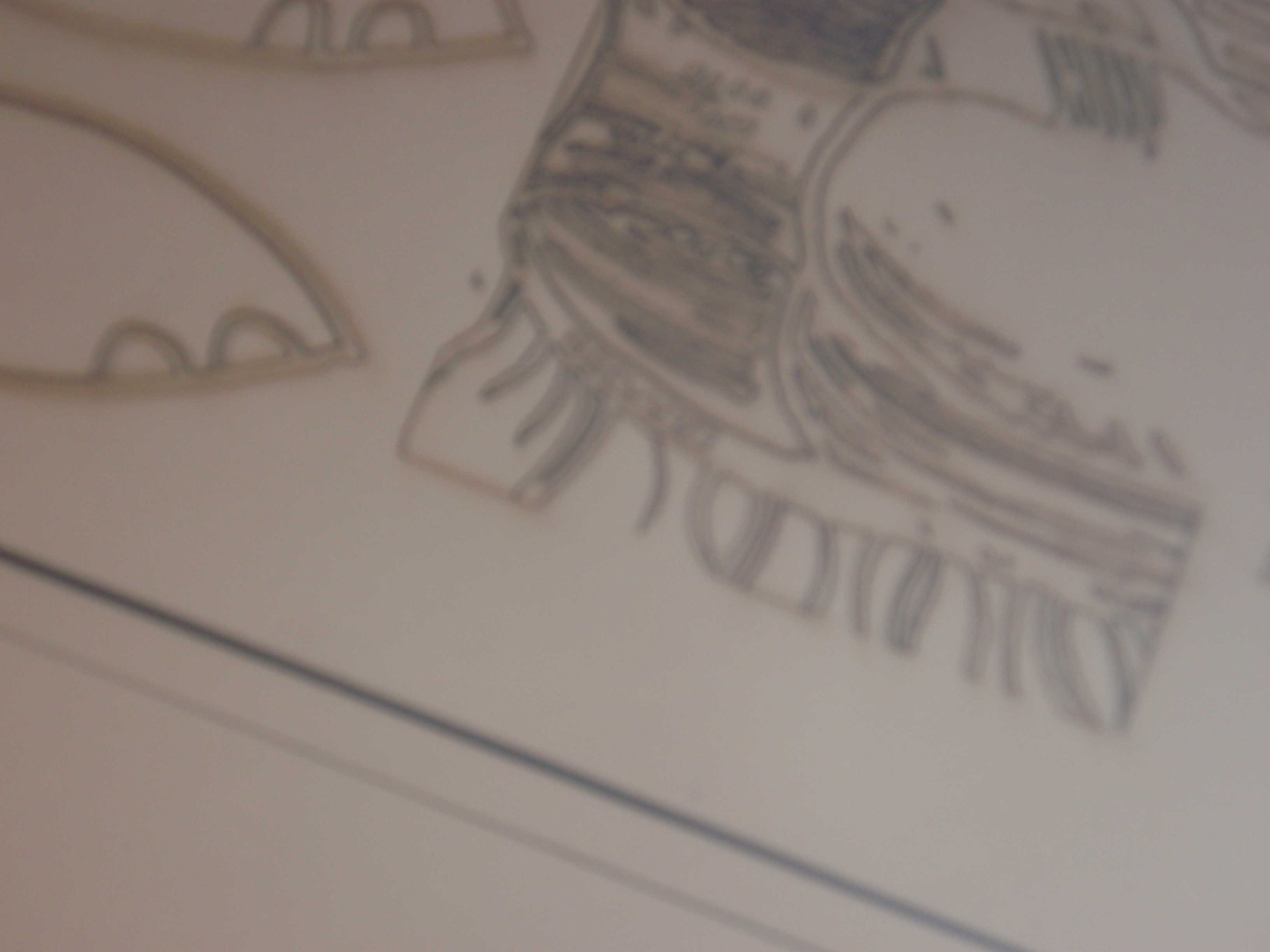
Botanical etching with obscuring layer of cross hatching.
I spent Friday morning in the print workshop and pretty much wrecked the prints with an unnecessary layer of mark making on both. I wasn’t a very happy bunny by the end of it. The plate with the four botanical images on had a pentimenti on the flower head which was getting on my nerves. I should have blocked it out but I didn’t and it was a bit too much; not a very stylish bit of pentimenti. I wanted to tone it down and the writing too so I put on a layer of crosshatching which just mucked it up entirely- you can’t see the rather wonderful backward writing anymore and you can still see the pentimenti so that was a disaster.
I quite like the idea and the idea has evolved in the etching so I might rework it from scratch and without the cross hatching and with more coherent words.
The other print worked to a degree. I reworked the flower head and left it in the acid for a long time and that emphasised the image and obscured some of the writing more. The flower head is inverted, Baselitz style. It isn’t great though.
So, I have to ask myself how much this has been a worthwhile exercise. I have developed these two ideas through the process of etching. The layering of the mark making comes out of the process of putting a ground on, marking, printing, regrounding the plate and making more marks. I haven’t entirely controlled the process as well as I have with the straighter drawing ones which I much prefer. I could prepare them more with Photoshop and so on, prepare the writing and so on. Though that works against the process leading to the idea. I could redo them as paintings or watercolours or monotypes.
The writing on the images is trying to get the voice of the artist, researcher and teacher into the work. And the idea of the images is to make work that directly relates to the (current) research question. These are supposed to be demonstrations, learning pieces. I am trying to learn about something so that I could teach it.
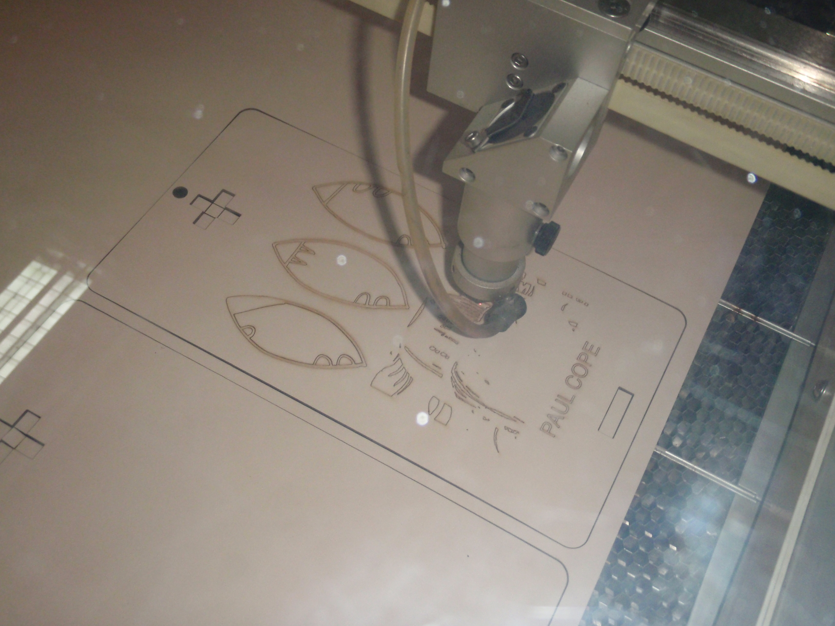
Some things have come out of these two pieces – the layering and the use of text. They could be laser cut prints like the cards I made. How the laser cutter would deal with a layered image might be interesting.

Second botanical plant image. Layers of abstract image made with Lascaux acrylic ground painted on and then car paint aqua tint with Dom. Further layers of writing and drawing through traditional grounds at NUCA.
What I tend to want to do is to be able to use a process so that I can improvise with it and have the process lead to ideas. I get frustrated if I can’t get the process to do that and if I feel that the process is dictating to me. I find the etching process quite awkward in itself which is interesting. It is slow and cumbersome and some of the etiquette is quite annoying.
Over the weekend I went over the Intaglio book and thought about what I was doing wrong. I also looked at the Edinburgh Printmakers website which has a nice easy guide to ‘safe’ printmaking, or at least safer. The attraction is that this water based set of processes both makes etching much simpler as it just becomes about grounds and stopping out and also opens it out into something much more complex as the range of things you can use as grounds and stops is broadened out considerably.
One of the reasons why this has been quite difficult for me, I think, is because, as an art teacher, I have tended to learn new processes in a relatively simple, classroom friendly form. We can’t do a lot of welding but I can knock you up and nice Anthony Caro in heavy card board with a low melt glue gun. With etching I have learnt it in a fully professional workshop with all the facilities and safety gear and I have to re-invent it for doing it in the shed or classroom once all this is over. If it is to remain part of my practice anyway. Being able to make this sort of work in the shed would be different anyway. Having the process in your possession is different to driving twenty five miles to the art college, over caffinating myself in the many cafes near the art college and then driving home again. Talking to David and working with Dom this summer has made me think differently about it and I am looking for a way to take more control over the process.
I also started a large acrylic image based on the ideas developed in the etchings yesterday. I prepared a surface with a blue similar to the Lascaux ground that I used on the plates and painted on the Penck like image that I had thrown on to the copper plate at the summer school as a first layer. Today I have started to put the words on in similar blues.

Abstract layer based on the layer of mark making on the etching plate started at the summer school.
Do I want the writing to be legible? Or do I want it to be semi-legible? Or not at all legible? Just a sign of writing being there as a visual thing? What is the point of writing being there if it isn’t legible? A sort of mumbling.
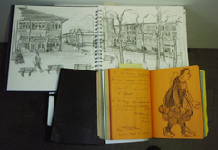
The idea is that the thing will look like a page of notes from a learning journal in some way.